Graphic Ephemeris
The purpose of the graph is to show the intensity of planet transits at a glance over a long period of time so that you can zero in on important events more quickly. They are meant to be used side by side with the time lords to determine active periods, either by topic, or in general. The graph does this by calculating planetary positions and other data at intervals specified by the Interval combo box in the graph's main window.
The first thing you need to do is set up a graph with the settings for date and range, the dial, interval settings, and specify which options to run. Then you draw the graph. Once the graph has been drawn, the custom heliacal graph and general graph buttons become disabled. To enable them, you must clear the graph for another drawing.
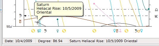
Once the graph is drawn, it is important to recognize what each of the graph items represent. If you have the heliacal option checked, then the heliacal phenomena are represented by small circular dots on the screen as shown below:
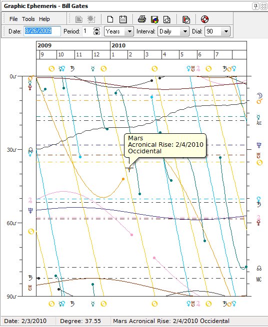
The horizontal dash-dot lines represent natal planets with colors that match the color of the planet in the Chart Designer. The wavy solid lines represent transiting planets. When you hover your mouse over a dot, a hint will be displayed showing the planet, heliacal phase and date.
Whenever your mouse hovers over the graph, it turns into a crosshair that marks the date and the degree position of the mouse in the status bar:
Clicking on the graph in the location of the crosshair will load the transits, progressions, etc (autogenerated charts) for that date into the outer wheel with the natal chart in the inside wheel, and brings up the transit animation (autogenerated) toolbar which is the same toolbar used by the time lord windows:
The horizontal line at the top of the graphic ephemeris window represents the date, with the months listed as numbers (June = 6, July = 7, etc). When a planet appears at the top or bottom of the graph it has crossed over one of the dial boundaries.
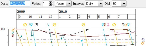
The degree positions are listed on the left side of the graph as a vertical line, starting with 0 degrees up to the range specified in the dial towards the bottom of the window. When a line on the graph crosses one of the horizontal dash-dot lines, it is in exact conjunction if the 360 degree dial is used, or if you used the 180 degree dial, it can represent an opposition or conjunction, and in the case of the 90 degree dial, it represents either an exact square, conjunction or opposition. If 2 solid lines cross this represents transiting planets in exact aspect.
The purpose of the dials (particularly the 90 degree dial) is to know when a planet is most chrematistikoi (busy, telling or oracular). If the lot of fortune is in one of the cardinal signs, then the first 30 degrees are the most oracular in a 90 degree dial. If fortune happens to be in one of the fixed signs, then 30 - 60 degrees of the 90 degree dial is most oracular, etc. This means that testimony happening in these places is considered more important.
The following topics will be explained:
Draw button
Heliacal Phenomena special setting button
Clear button
Current date button
Print button
Save as gif image button
Viewing gif image in default image viewer
Graphic Ephemeris Options button
Date field
Period spin edit and time unit drop down list
Interval checking drop down list
Dial type drop down list
Dots on graph as heliacal hover points
Clicking on graph to get autogenerated charts
Statusbar monitor fields at bottom
